忘れがちなggplot2でのcolとfillの色指定方法をザクッとまとめました。軸に設定した離散値、連続値を意識すると理解しやすいのではと思います。
tidyverseのバージョンは1.3.1。windows 11のR version 4.1.2で動作を確認しています。
パッケージのインストール
下記コマンドを実行してください。
#パッケージのインストール
#install.packages("ggplot2")
install.packages("tidyverse")
色指定方法のまとめ
詳細はコマンド、パッケージのヘルプを確認してください。
#パッケージの読み込み
#library("ggplot2")
library("tidyverse")
###準備#####
#データ例の作成
n <- 300
PlotData <- data.frame(ID = rep(1:5, len = n),
Group = sample(c("A", "B", "C"), n, replace = TRUE),
Time_A = abs(rnorm(n)), Time_B = -log2(abs(rnorm(n))))
#Group情報で色を付与
PlotData <- PlotData %>%
#case_whenは条件式 ~ 結果で指定します
mutate(GroupCol = case_when(Group == "A" ~ "#a0b981",
Group == "B" ~ "#47547c",
Group == "C" ~ "#9f8288"))
#色の確認 #https://www.karada-good.net/analyticsr/r-109
#install.packages("scales")
#library("scales")
#show_col(c("#a0b981", "#47547c", "#9f8288"))
#プロットを並べて表示するのに便利なパッケージ
#https://www.karada-good.net/analyticsr/r-591
#install.packages("multipanelfigure")
library("multipanelfigure")
########
###データに色情報が含まれている場合:scale_XXX_identityコマンド#####
#colを指定する場合:scale_colour_identityコマンド
PointPlot <- ggplot(PlotData, aes(x = Time_A, y = Time_B)) +
geom_point(aes(col = GroupCol), size = 2) +
scale_colour_identity(guide = "none") +
labs(title = "scale_colour_identity")
#fillを指定する場合:scale_fill_identityコマンド
BarPlot <- ggplot(PlotData, aes(x = Group)) +
geom_bar(aes(fill = GroupCol)) +
scale_fill_identity(guide = "none") +
labs(title = "scale_fill_identity")
#プロット
multi_panel_figure(columns = 2, rows = 1) %>%
fill_panel(panel = PointPlot, column = 1, row = 1, label = "") %>%
fill_panel(panel = BarPlot, column = 2, row = 1, label = "")
########
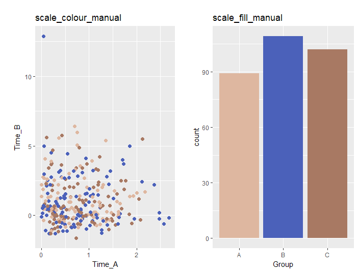
###色情報を指定する:scall_XXX_manualコマンド#####
#colの場合:scale_colour_manualコマンド
PointPlot <- ggplot(PlotData, aes(x = Time_A, y = Time_B)) +
geom_point(aes(col = Group), size = 2) +
scale_colour_manual(values = c("#deb7a0", "#4b61ba", "#a87963"), guide = "none") +
labs(title = "scale_colour_manual")
#fillの場合:scale_fill_manualコマンド
BarPlot <- ggplot(PlotData, aes(x = Group)) +
geom_bar(aes(fill = Group)) +
scale_fill_manual(values = c("#deb7a0", "#4b61ba", "#a87963"), guide = "none") +
labs(title = "scale_fill_manual")
#プロット
multi_panel_figure(columns = 2, rows = 1) %>%
fill_panel(panel = PointPlot, column = 1, row = 1, label = "") %>%
fill_panel(panel = BarPlot, column = 2, row = 1, label = "")
########
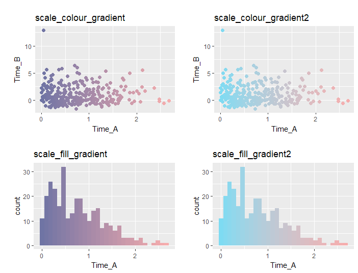
###グラジエント化:scall_XXX_gradient,scall_XXX_gradient2コマンド#####
#colの場合:scale_colour_gradientコマンド
#colに指定するデータは連続変数
PointPlot1 <- ggplot(PlotData, aes(x = Time_A, y = Time_B)) +
geom_point(aes(col = Time_A), size = 2) +
scale_colour_gradient(low = "#6f74a4", high = "#f6adad", guide = "none") +
labs(title = "scale_colour_gradient")
#colの場合:scale_colour_gradient2コマンド
#colに指定するデータは連続変数
PointPlot2 <- ggplot(PlotData, aes(x = Time_A, y = Time_B)) +
geom_point(aes(col = Time_A), size = 2) +
scale_colour_gradient2(low = "#6f74a4", high = "#f6adad", mid = "#7edbf2", guide = "none") +
labs(title = "scale_colour_gradient2")
#fillの場合:scale_fill_gradientコマンド
histogram1 <- ggplot(PlotData, aes(x = Time_A)) +
geom_histogram(aes(fill = ..x..)) +
scale_fill_gradient(low = "#6f74a4", high = "#f6adad", guide = "none") +
labs(title = "scale_fill_gradient")
#fillの場合:scale_fill_gradient2コマンド
histogram2 <- ggplot(PlotData, aes(x = Time_A)) +
geom_histogram(aes(fill = ..x..)) +
scale_fill_gradient2(low = "#6f74a4", high = "#f6adad", mid = "#7edbf2", guide = "none") +
labs(title = "scale_fill_gradient2")
#プロット
multi_panel_figure(columns = 2, rows = 2) %>%
fill_panel(panel = PointPlot1, column = 1, row = 1, label = "") %>%
fill_panel(panel = PointPlot2, column = 2, row = 1, label = "") %>%
fill_panel(panel = histogram1, column = 1, row = 2, label = "") %>%
fill_panel(panel = histogram2, column = 2, row = 2, label = "")
########
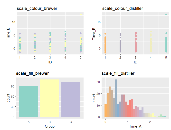
###色パレットを利用:scall_XXX_brewer,scall_XXX_distillerコマンド#####
#色パレットは次のコマンドで確認:RColorBrewer::display.brewer.all()
#colの場合:scale_colour_brewerコマンド
PointPlot1 <- ggplot(PlotData, aes(x = ID, y = Time_B)) +
geom_point(aes(col = Group), size = 2) +
scale_colour_brewer(palette = "Set3", guide = "none") +
labs(title = "scale_colour_brewer")
#colの場合:scale_colour_distillerコマンド
PointPlot2 <- ggplot(PlotData, aes(x = ID, y = Time_B)) +
geom_point(aes(col = ..x..), size = 2) +
scale_colour_distiller(palette = "Set3", guide = "none") +
labs(title = "scale_colour_distiller")
#fillの場合:scale_fill_brewerコマンド
histogram1 <- ggplot(PlotData, aes(x = Group)) +
geom_histogram(aes(fill = Group), stat="count") +
scale_fill_brewer(palette = "Set3", guide = "none") +
labs(title = "scale_fill_brewer")
#fillの場合:scale_fill_distillerコマンド
histogram2 <- ggplot(PlotData, aes(x = Time_A)) +
geom_histogram(aes(fill = ..x..)) +
scale_fill_distiller(palette = "Set3", guide = "none") +
labs(title = "scale_fill_distiller")
#プロット
multi_panel_figure(columns = 2, rows = 2) %>%
fill_panel(panel = PointPlot1, column = 1, row = 1, label = "") %>%
fill_panel(panel = PointPlot2, column = 2, row = 1, label = "") %>%
fill_panel(panel = histogram1, column = 1, row = 2, label = "") %>%
fill_panel(panel = histogram2, column = 2, row = 2, label = "")
########
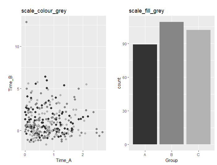
###グレースケール化:scale_XXX_greyコマンド#####
#colの場合:scale_colour_greyコマンド
PointPlot <- ggplot(PlotData, aes(x = Time_A, y = Time_B)) +
geom_point(aes(col = Group), size = 2) +
scale_colour_grey(start = .2, end = .7, guide = "none") +
labs(title = "scale_colour_grey")
#fillの場合:scale_fill_greyコマンド
BarPlot <- ggplot(PlotData, aes(x = Group)) +
geom_bar(aes(fill = Group)) +
scale_fill_grey(start = .2, end = .7, guide = "none") +
labs(title = "scale_fill_grey")
#プロット
multi_panel_figure(columns = 2, rows = 1) %>%
fill_panel(panel = PointPlot, column = 1, row = 1, label = "") %>%
fill_panel(panel = BarPlot, column = 2, row = 1, label = "")
########出力例
データに色情報が含まれている場合
・scale_XXX_identityコマンド
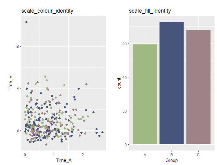
色情報を指定する
・scall_XXX_manualコマンド
グラジエント化
・scall_XXX_gradient,scall_XXX_gradient2コマンド
色パレットを利用
・scall_XXX_brewer,scall_XXX_distillerコマンド
グレースケール化
・scale_XXX_greyコマンド
少しでも、あなたのウェブや実験の解析が楽になりますように!!