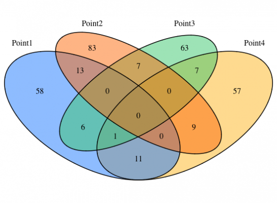
Venn diagrams are useful for interpreting data, and there are many ways to create Venn diagrams in R. The “VennDiagram” package is useful because it allows you to treat data as a list, but if you have more than 4 comparisons, the data will not be ordered from left to right when plotted. However, if the number of data to be compared is 4 or more, the data will not be ordered from left to right when plotted, so you will need to be creative. In the ‘Execute command’ we have adjusted the data so that it is lined up from left to right.
Install Package
install.packages("VennDiagram")Execute command
#Loading the library
library("VennDiagram")

###Creating Data Examples#####
A <- sample(1:1000, 100, replace = FALSE)
B <- sample(200:800, 100, replace = FALSE)
C <- sample(300:500, 100, replace = FALSE)
D <- sample(400:600, 100, replace = FALSE)
Data <- c(A, B, C, D)

#Assume 4 data
Point <- sample(c("Point1", "Point2", "Point3", "Point4"),
                   length(Data), replace = TRUE)

#Creation of data
ProtData <- data.frame(Data, Point)
########

###Plot a Venn Diagram#####
#Create labels, sort in descending order
Point <- sort(as.character(unique(ProtData[, 2]))) #Specify measurement column
#Adjustment so that measurement points are aligned from left to right
ifelse(length(Point) > 3, Point <- c(Point[1], Point[length(Point)],
                                           c(Point[2:(length(Point) - 1)])), invisible())

#Create a list to use for Venn diagram plotting
VennList <- vector("list", length(Point))
names(VennList)  <- Point

for(n in seq(Point)){
  VennList[[n]] <- subset(ProtData[, 1], ProtData[,2] %in% Point[n])
}

###Setting up a Venn diagram plot#####
#Set Venn diagram fill color
FillCol <- c("dodgerblue", "goldenrod1", "darkorange1", "seagreen3", "orchid3")

#Plot
grid.newpage()
grid.draw(venn.diagram(
  x = VennList,
  fill = FillCol[1:length(Point)],
  filename = NULL))
Output Examples

I hope this makes your analysis a little easier !!


